Process
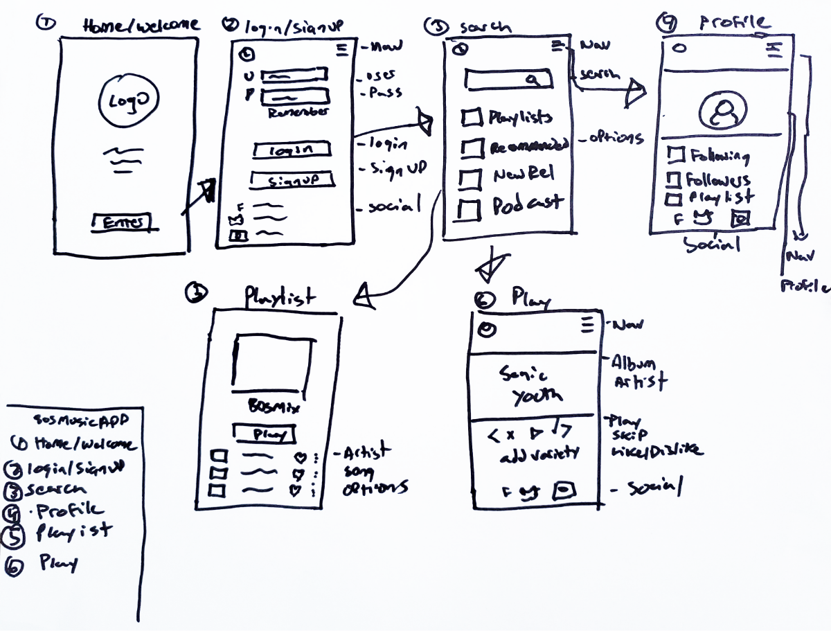
I began drawing out my low fidelity prototypes in order to gauge what was working for me. After a few renditions I decided that this sketch was to be the beginning for the app.
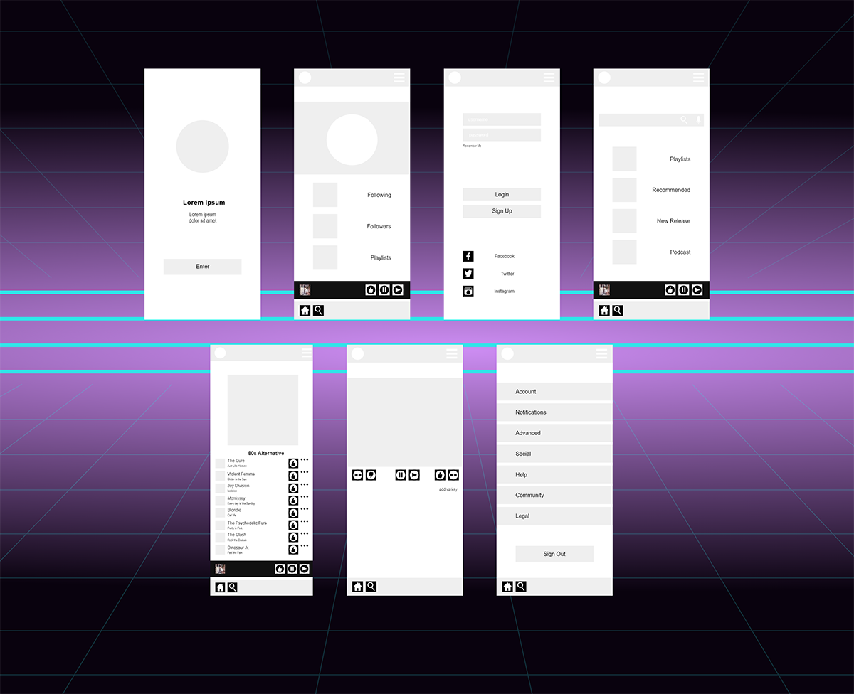
Once I was satisfied with my initial drawings I began to digitize my wireframes and add icons. Aligning everything to a set grid was essential in making sure my app screens would work with the final design.
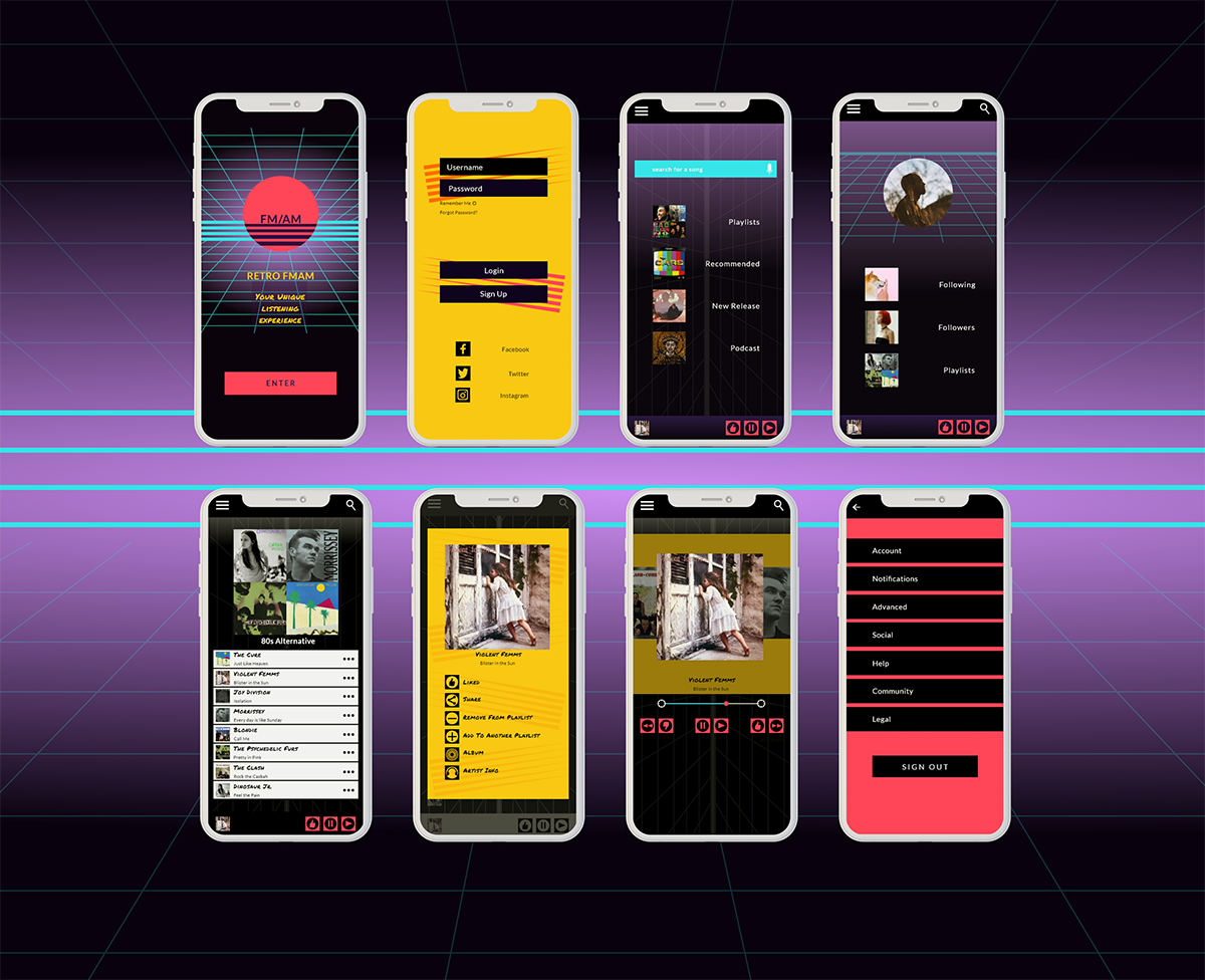
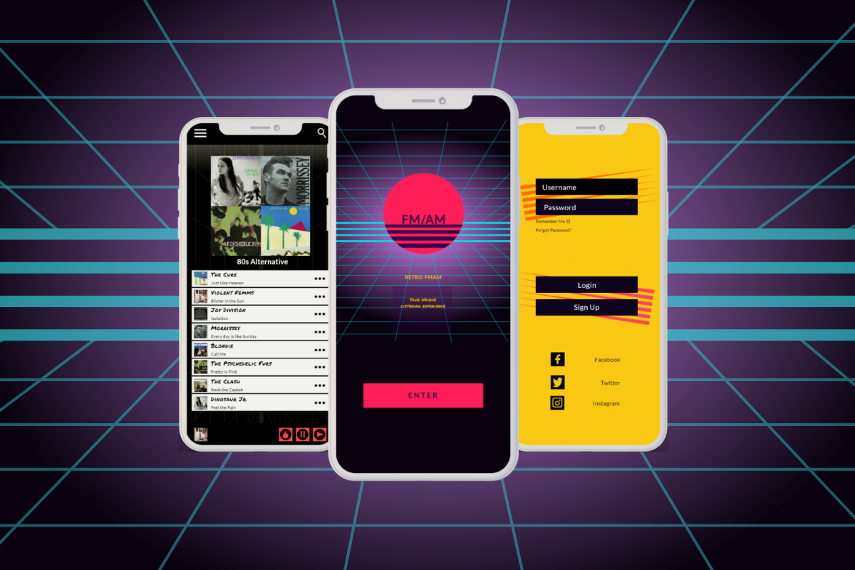
Here is the final product for my 1980s music app. With a few changes I decided to create a model so the user could more easily filter and customize their playlists.
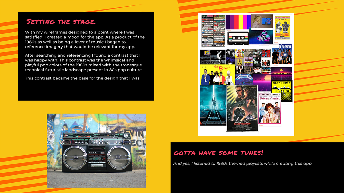
The design is a play off my concept of the contrast between the futuristic feel and playfulness of pop culture of the 1980s. I am really proud of how my app turned out. The user will be happy using the app with its super easy to use ui as well as being immersed with 1980s
totally rad feel!
