Process
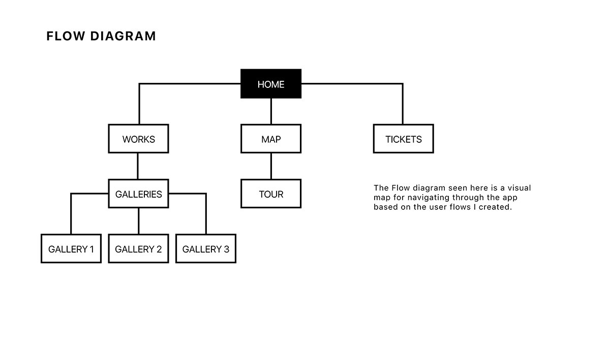
Initially, after researching, I began to create user flows so I could have a good sense on how the user would navigate through the app. After this I created a Flow Diagram seen on the next page.
Drawing out ideas
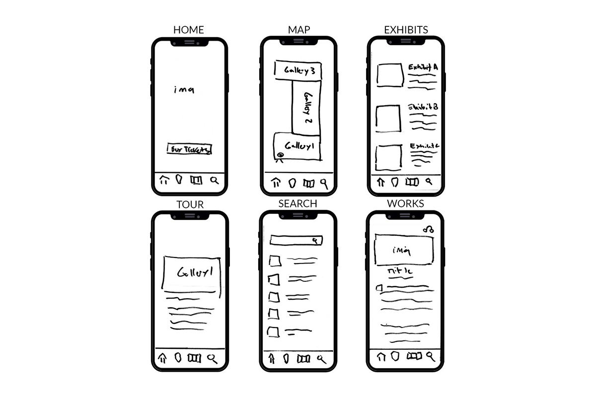
I always start every visual design I create by drawing out my ideas before digitizing them. These examples became the foundation for the screens I would create. By drawing the screens first, I was able to prioritize my workflow and remove any initial flaws before I moved to a digital environment.
Digitizing for both iOS and Android
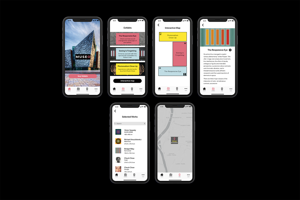
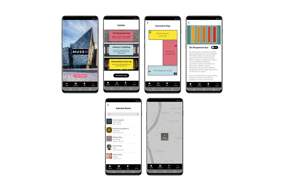
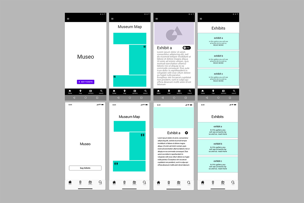
At this stage, I began digitizing my low fidelity wireframes by creating my mid fidelity wireframes for both Android and iOS versions of my app.
Figuring out the differences
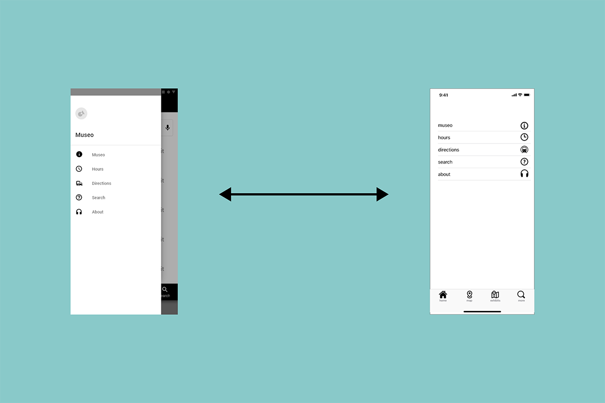
One of the challenges I had while creating my mid fidelity wireframes was being able to recognize and understand the differences between Android and iOS. This process involved reading the design guideline documentation for both Material and iOS design as well as locating and implementing the necessary files and graphics for each platform.
Deciding what works
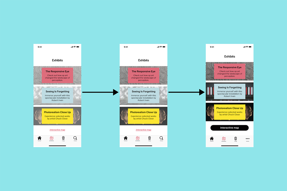
As I began to style my pages, one of the challenges I overcame was figuring out which screen was the right one for my design and vision. By having several options to choose from I was able to curate the which screen was best for my design.
Final selected iOS and Android screens
